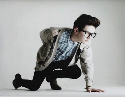
My fashion students initial idea was to have the models standing in a busy town, after discussion she said she wanted a simple background but also location shots. She wanted all the attention to be on the model, which after a discussion we both agreed on the simple but effective approach. One of our initial ideas was to take the model and place them in a normal situation, like a kitchen, shower and other settings around the house. Of course, this sounds a tad simple but with the models face paint and behaviour the photograph would of seemed more interesting than just someone taking a shower or making a cup of tea. The final choice was to have the model in front of a white background and also shots of the model up a tree.
 Choosing the colouring for the photographs, i experimented with different lighting and when editing; different colouring. Some photographs like the one presented to the left is dark and mysterious. The eyes in particular create a sense of uneasiness and mystery. I feel this worked well especially with the blank expression on the models face. The student wanted the model to have a sense of sexual element to him, so we decided he would model one piece of item at a time showing his chest. For the brighter photographs also displayed on the right i used bright lighting and minimal editing, addin a soft colouring to the photograph.
  When planning the photographs of the model up a tree, i decided i wanted to experiment with these photographs different to the ones taken against the white background. I wanted to use more colour and different angles than the basic portrait approach. After searching for the right tree, we found a forest and i attempted to prompt the model how to sit and behave. I feel the location shots turnt out well and i especially like the bright colours and position of the model sitting on a high branch.
 Overall i am happy how the photographs turnt out and i feel my fashion student was happy with the out come too. The model looks intense and mysterious which was what we set out to do. If i was to do this fashion shoot again, i would take the photographs against the white back in a studio. I feel in a studio, different and better techniques of lighting could of been used making the photograph even more interesting.


